Showing posts with label stainless steel. Show all posts

Monday, 13 October 2014

Beautiful Modern New Build with High Gloss Kitchen

We have an exciting new build to show you today, with many beautiful features including a white high gloss kitchen by Planet. The brief for the build was to create a modern family home which was achieved by using plenty of contemporary finishes such as glass and stone. The large windows and feature skylight flood the house with light which also adds to the spacious modern feel.

The imposing front facade of the house.


The large entrance hall has a dramatic glass ceiling above which brings light into the space.  


The stunning skylight and glass floor in the landing floods light into the entrance hall below.


The large kitchen space is zoned into different areas by use of furniture and feature lighting creating a wonderful place to gather and entertain and take in the wonderful views of the garden.


The kitchen itself features white high gloss Parapan doors with walnut accents complimented by a beautiful Corian work surface. It has a combination of base units, lift-up wall units and a full height storage wall maximising the amount of space available. It also has a large sit at breakfast bar and state of the art stainless steel appliances from Miele.


The breakfast bar showcases the capabilities of Corian beautifully with its curved design.


The area has a great chill out sofa space..


and a large dining area for entertaining.


The stunning view of the house from the garden.


What do you think of the style of this house? Do you like the contemporary look and feel or would you prefer something more traditional? We'd love to hear what you think.

Here at Planet Furniture we provide a range of furniture styles so we're sure to have something to suit you, call us today for a free no obligation design quotation.

Monday, 1 September 2014

Beautiful Storm Grey Shaker Kitchen

 We have one of our recently completed projects to share with you today. This storm grey shaker kitchen is part of a beautiful new extension which provides a perfect family space to gather and entertain.
 

The lay-on style furniture is painted in the wonderfully muted tones of Farrow and Ball with the perimeter cabinets in Pavillion Grey and the island painted in Mole's Breath. The 30mm Caesarstone Osprey worksurfaces contrast beautifully with the rest of the kitchen.


 Below you can see the beautiful light flooded extension with its large folding, sliding doors to the garden and roof lights.


The stainless steel appliances are from Neff apart from the wine fridge which is from Caple. The cabinet handles and knobs are chrome.

 
The Franke Ariane undermounted sink is complimented with a Franke Eiger tap and a Quooker Design boiling hot water tap. The island is given extra focus with these simple hanging pendant lights and the under pelmet cabinet lighting gives a subtle wash of colour to the kitchen back wall.

 
We hope you like this kitchen? If you have a furniture project you'd like to discuss whether it be domestic or commercial then please don't hesitate to get in touch!


Sunday, 9 February 2014

Glossy and Sleek Commercial Office Kitchen

Here at Planet we love to get involved in a variety of different projects so when a commercial opportunity came up and we were asked by a local company to redesign their office kitchen area we were more than happy to oblige! 

The brief was to create a smart and practical space with a small seating area if possible.

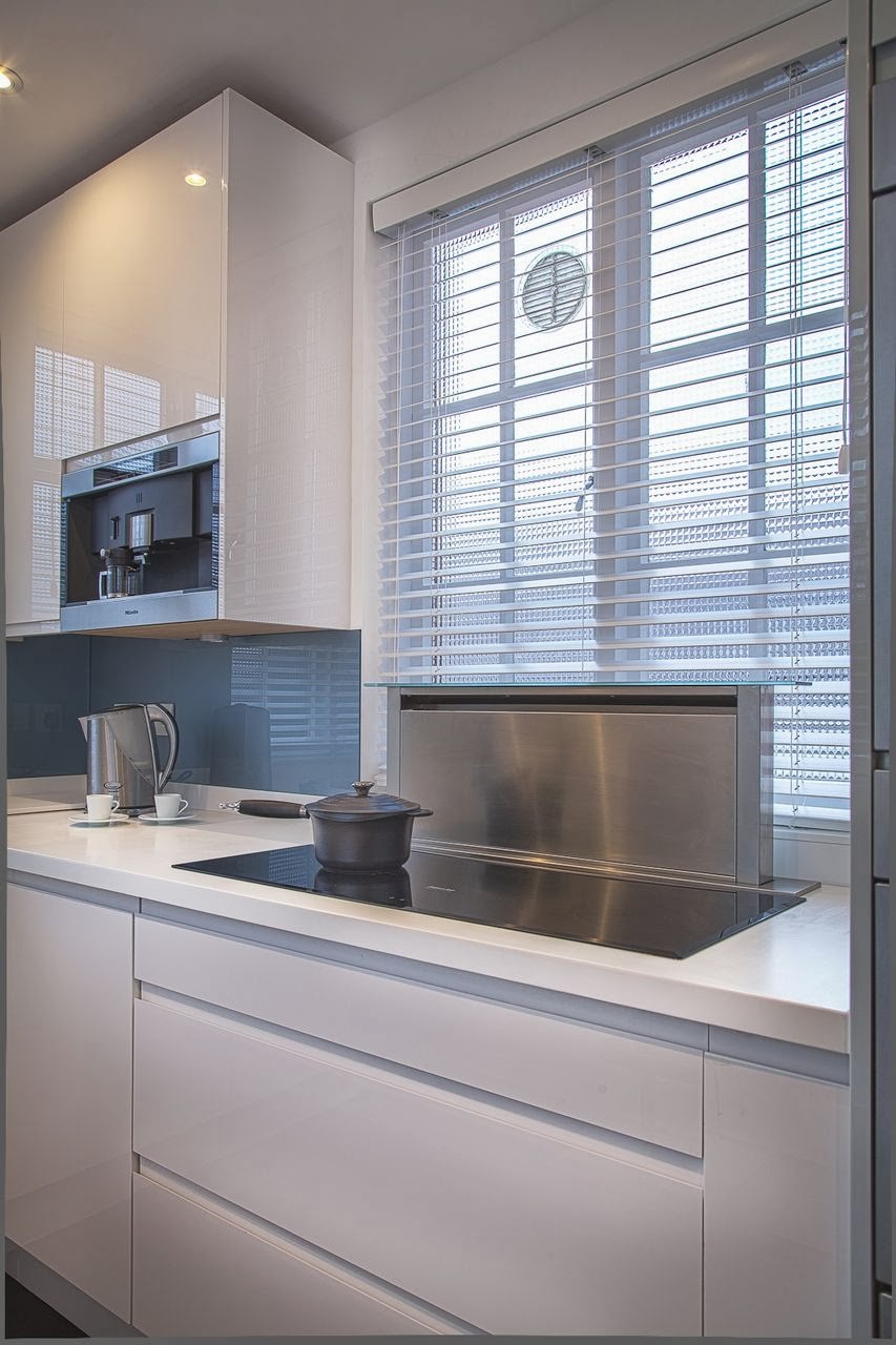
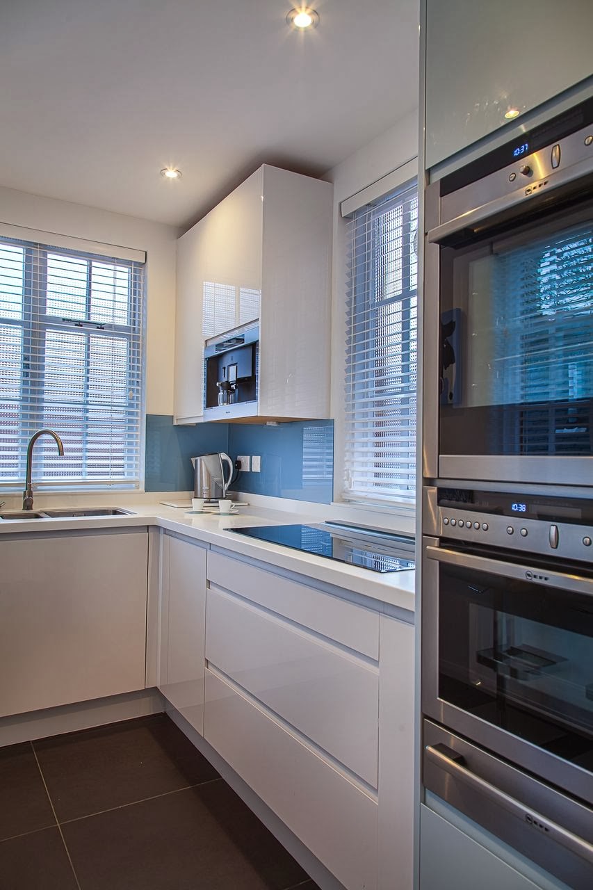
The kitchen is a lay-on style with white Parapan flat doors with recessed handles. The high gloss finish reflects the light from the large windows beautifully giving a real sense of space.   


The stunning curved sit at bar area below was formed out of Corian and makes an ideal area for coffee or lunch. Corian is great to work with as the design possibilities are endless. This kitchen also features curved upstands which is a great little detail and hygenic too.  


The Miele induction hob is flush fitted into the Corian worktop and the clever Caple downdraft extractor behind can be hidden away when not in use...


...as you can see in the photo below, no extractor!

The Neff ovens and warming drawer allow for various cooking options, you could comfortably cook for a dinner party in this compact kitchen space! 


The Miele coffee machine is integrated into a wall unit rather than having a freestanding one taking up worktop space. The blue glass splashbacks not only look great but are hygenic and easy to clean which is important in this environment.


The tall cabinets below provide plenty of storage space and the addition of white venetian blinds is in keeping with the contemporary feel.


What do you think of this as an office kitchen? Would having a kitchen like this at work encourage you to have different lunches possibly? Do you like the materials that have been used? Do let us know what you think.

Thursday, 23 January 2014

Beautiful Retro Inspired Kitchen


We thought we'd share a beautiful retro inspired kitchen with you today. The brief was to create a simplistic but stylish space for the family to cook, entertain and relax in.
 
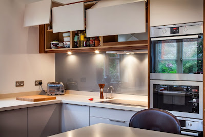
The kitchen is lay-on style with flat painted doors featuring push catch opening mechanisms to the wall units. The end panels, plinth and cornice are walnut which provides some contrast and warmth to the otherwise muted colour scheme of grey and white.
 
 
Not having handles on the wall units gives a clean and streamlined look to the cabinets.

 
The doors fold open towards the ceiling to reveal the cabinet interior, no banging your head on the wall cupboard doors in this kitchen!
 

The base units have beautifully simple stainless steel handles. The hob is flush fitted into the worktop with the extractor neatly housed in the wall unit above. A bank of tall ovens ensures ample cooking space, the stainless steel finish in keeping with the contemporary feel throughout.


The chunky Corian worktop is formed into a large breakfast bar area ideal for casual dining or food preparation.


The tall cabinets below provide plenty of storage..
 
 
but they also slide open to reveal something else..
 
 
a hidden desk area! With internal shelving and compartments for keeping paperwork.

 
The beautiful copper bowl light provides a stunning focal point over the bar area with the orange blinds complimenting the warm tones within the walnut.


The grey glass splashback is a great alternative to tiling and reflects the light beautifully.


So what are your thoughts on this kitchen? Do you like the handle-less look? Would you benefit from a desk area in your own kitchen? We'd love to know what you think. 


Thursday, 21 November 2013

Beautiful Period Home Refurbishment

We've got an exciting project to show you today!

We were asked to provide the furniture throughout this newly remodelled period house and we knew that the result was going to be stunning as the property belonged to a retired architect. We were involved at an early stage, which is always great as we can influence the design to make the best of the available space.

The brief for the kitchen was to create a simplistic and functional space for cooking, socialising and relaxing with the emphasis being on design and materials. This was achieved with a mostly white and stainless steel colour scheme against a real oak floor which gives the room warmth. 


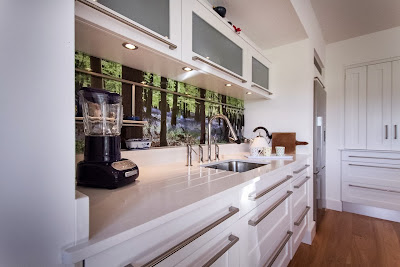
The client wanted a focal point for the kitchen and as the house is situated in a village with beautiful woods nearby, decided to incorporate a photo of them in bluebell season, for which we provided the photography which was fun to shoot! The photo was then enlarged and applied to the wall behind the sink run with clear glass on top for protection. This really is a beautiful and unexpected way of adding colour to a neutral space and can be changed when required.


Heres a closer shot of the photograph splashback which I'm sure you'll agree looks stunning.


The kitchen is lay-on in design with hand painted shaker doors and frames with brushed stainless steel bar handles. As we were involved in the design from an early stage we were able to recess the Neff ovens and two cooks pantrys (at the back of the photo below) neatly into the kitchen wall. The doors of the cooks pantrys fold back to create maximum storage and small working areas inside. 


The work surfaces throughout are white quartz adding to the modern but understated feel and the island has beautiful stainless steel legs and supports running around it's perimeter. The Neff induction hob is flush fitted and we also designed in an integrated chopping board. As you can see below there is a cosy corner with a sofa to relax in along with seating at the far end of the island.


We also designed these handpainted bookcases in the living room either side of the beautiful fireplace. 


They are painted in shades of grey from Farrow and Ball and have cockbead detailing to each shelf and frame. 


The bookcase below also discreetly houses the T.V. 


The bi-fold doors can be opened and closed accordingly.


The client also requested a small bar area adjoined to the lounge which we thought was a really neat idea! Ideal for entertaining especially at large social gatherings.


Here's another bookcase we installed below.


And finally we designed this beautiful desk using the same detailing as the kitchen island.


We were very lucky to be involved in such a wonderful project. What do you think about the kitchen with it's bluebell splashback? Do you like the muted colour scheme used throughout? And the bar area next to the lounge? We'd love to know your thoughts.


Thursday, 31 October 2013

A Funky Open Plan Family Kitchen

Hello Again! Thanks for visiting our blog, grab a coffee and come take a look at this funky open plan kitchen with us.

The kitchen area was totally remodelled and a beautiful extension was added to the existing building, creating a wonderfully large family kitchen/ dining/ relaxing area. The furniture style is lay-on in a mixture of oak and hand painted ivory.    


The velux roof windows and bi-fold sliding doors to the garden flood the space with light and this is reflected beautifully in the surfaces throughout the area such as the black granite worktops and large grey floor tiles.

The space is softened with a corner for relaxing with two large comfy sofas positioned against a striking feature wallpaper backdrop which provided the inspiration for the colour of the accessories throughout the kitchen.


The green glass pendant lights provide a focal point and sit perfectly above the large oak dining table.


The main sink is positioned at the back of the kitchen with a handy prep sink in the island also. The clear glass splash backs are fixed over the green paint colour, providing a simple and practical way to protect the walls behind, they also help to reflect light into that part of the kitchen.


The island has a large curved overhang which enables comfortable seating on the funky high stalls. We also specified a Quooker boiling water tap here for maximum convenience.  


As the family are keen bakers we also included a cooks pantry in the design as shown below. It's a really flexible storage/ working area, the bi-fold doors that sit on the worktop can be folded back which allows for full use of the work surface inside. They are great for storing mixers, coffee machines, microwaves, bread makers etc as they can be used in their current stored position and can then just be shut away after neatly.


The kitchen is complimented by the smart stainless steel Miele appliances.


The tall larder below provides maximum dry food storage and is finished beautifully inside with the oak.


The view from the garden where the boundary between inside and out are blurred by the use of a similar floor tile in both areas.


So what do you think about this kitchen? Do you like the finishes and colours used?